Pitch Deck Mastery: 5 Winning Examples that Nail Guy Kawasaki's 10‑20‑30 Rule
Ever stared at a deck and felt the weight of every slide? That pressure comes from trying to cram too much into too little time. Guy Kawasaki’s 10‑20‑30 principle cuts the fluff and keeps the story tight. Below you’ll find five decks that embody this rule and the secrets that make them work.
The 10‑20‑30 Principle Explained
Guy Kawasaki distilled the art of pitching into three simple rules: ten slides, twenty minutes, thirty‑point font. The idea is to give the audience enough room to absorb each idea without getting lost in the details. This framework forces you to prioritize what matters most and keeps your narrative focused.
When you follow this rule, you create a rhythm that mirrors a well‑paced conversation. It prevents the slide deck from turning into a lecture and instead turns it into a dialogue. The result? A clearer message and a stronger connection with your listeners.
Key Takeaways
- Limit to ten slides: Every slide must earn its place.
- Keep it short: Twenty minutes is a sweet spot for most investors.
- Use large font: Thirty points ensures readability and reduces eye strain.
Top Pitch Deck Examples
Airbnb’s Investor Deck
Airbnb’s deck starts with a bold problem statement that instantly hooks the audience. The visuals are clean, and each slide tells a piece of the overall story. The team’s credibility is showcased early, building trust before the numbers appear.
What makes this deck stand out is its use of storytelling to humanize the data. Every statistic is tied back to a real customer experience, turning abstract numbers into relatable anecdotes.
- Problem‑first framing.
- Data backed by real stories.
- Clear call to action.
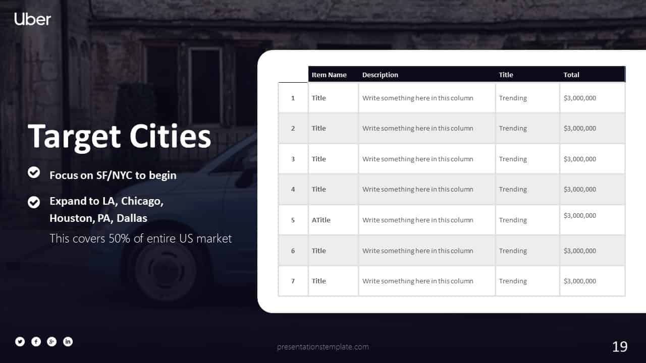
Uber’s Early Pitch
Uber’s deck cuts straight to the point with a single slide that defines the problem and solution. The visual hierarchy guides the eye from the problem to the solution in a logical flow.
Its minimalist design keeps the audience focused on the core message. The use of a single, striking image makes the idea instantly memorable.
- One‑slide problem/solution.
- Minimalist graphics.
- Strong visual anchor.
Dropbox’s Deck
Dropbox’s deck excels in clarity. The team uses a simple color palette and clean lines to keep the focus on the content. Each slide builds on the last, creating a narrative that feels natural.
The deck’s strength lies in its balance between text and visuals. It avoids clutter and lets each point breathe.
- Consistent color scheme.
- Balanced text and imagery.
- Logical progression.
Slack’s Storyboard
Slack’s deck tells a story of workplace collaboration. It uses a storyboard format that feels like a comic strip, engaging the viewer in a familiar rhythm.
By weaving customer testimonials into the narrative, Slack adds authenticity without breaking the flow. The deck feels conversational, almost like a friendly chat.
- Storyboard layout.
- Customer testimonials.
- Conversational tone.
Canva’s Visual Pitch
Canva turns the pitch deck into a design playground. The deck showcases its own product, demonstrating how easy it is to create stunning visuals.
Each slide is a showcase of Canva’s capabilities, making the product the hero of the presentation. The design is bold, colorful, and instantly recognisable.
- Product demo within the deck.
- Bold colour palette.
- Showcase of design tools.
How to Apply the Principle
Step 1: Keep It Short
Start by drafting a one‑sentence summary of your business. This forces you to focus on the core idea and eliminates fluff. Once you have that, trim each slide to its essentials.
Remember, the goal is to convey a story, not a spreadsheet. Every slide should feel like a chapter in a novel, not a bullet list.
Step 2: Use 20 Slides
Allocate one slide per key point. The first slide introduces the problem, the next covers the solution, and so on. Keep the sequence logical and easy to follow.
When you hit the limit, review each slide. If it doesn’t add a new layer of insight, consider dropping it.
Step 3: 30 Point Font
Large font improves readability and signals confidence. It forces you to keep text minimal, which in turn sharpens your message.
Use bold for emphasis and keep the rest of the text plain. This contrast makes the key points pop.
Common Pitfalls and Fixes
Overloading Slides
Too many slides can overwhelm the audience. If you find yourself adding a new slide for every statistic, pause and ask yourself if the number truly adds value.
Instead, combine related data into a single visual. A well‑crafted chart can replace several bullet points.
Too Small Text
Small fonts make the deck feel rushed and hard to read. If you’re tempted to cram more text, try rephrasing or using icons.
Icons can convey complex ideas in a single glance, freeing up space for narrative.
Conclusion
Mastering the 10‑20‑30 rule turns a good pitch into a memorable one. By trimming the noise, focusing on the story, and presenting with clarity, you give investors the chance to see the vision you’re building.
Try building your deck with these five examples as a guide. Keep the slides crisp, the font large, and the narrative tight. Your next pitch could be the one that lands the funding you need.