How to Choose the Perfect Film Pitch Deck Template for Indie Filmmakers in 2024
Why a Strong Pitch Deck Matters
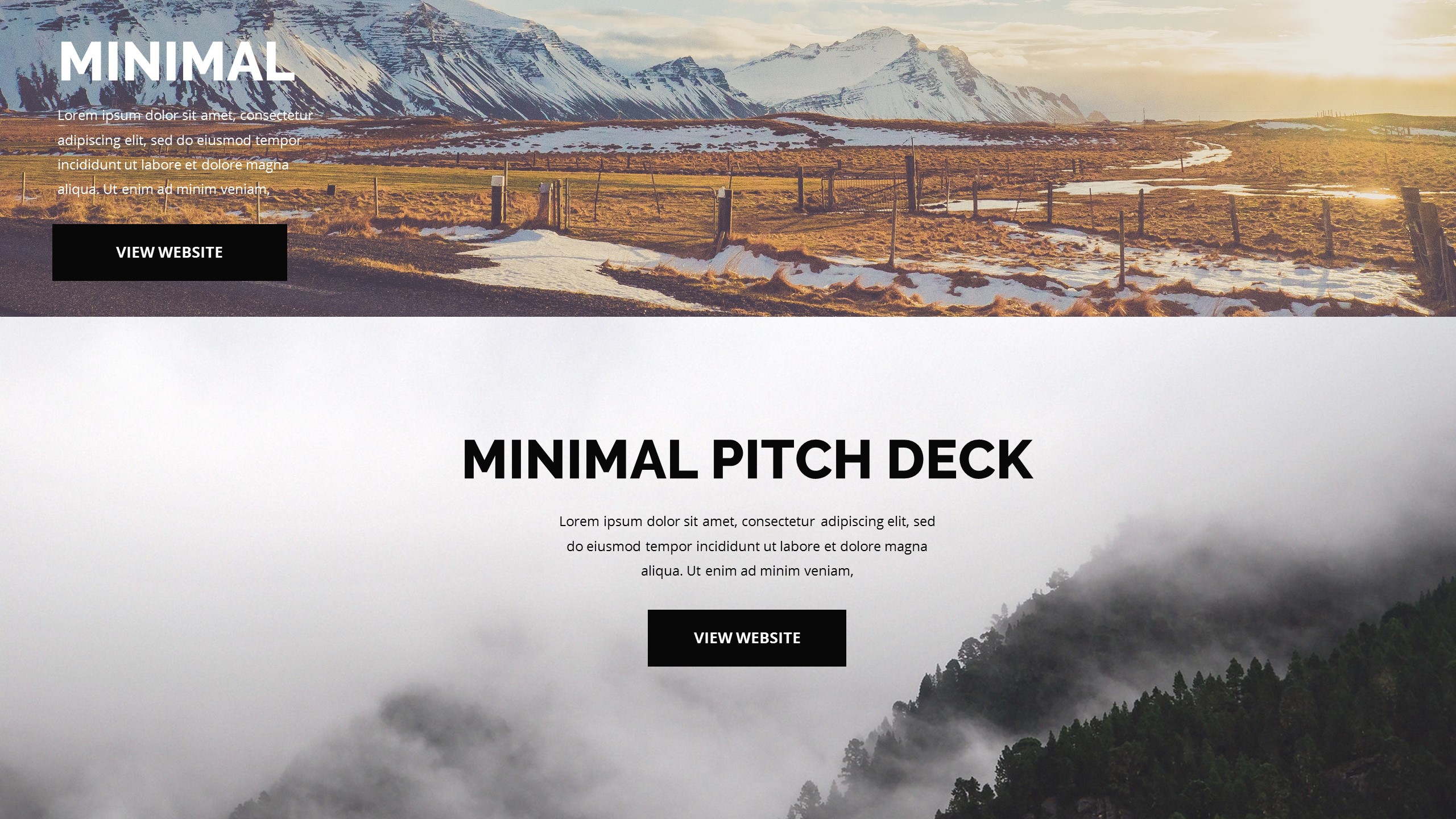
Grabbing Attention in a Crowded Market
When you walk into a meeting with a producer, the first thing they see is your deck. It works like a movie trailer for your idea – a quick, visual promise of what’s to come. If the design feels flat, the story can get lost before you even speak.
What I’ve learned is that a clean layout helps you highlight the hook, the tone, and the budget without drowning the reader in text. A well‑structured deck lets you guide the conversation, pointing the eye to the most compelling parts of your vision.
Think of it as setting the stage: the right colors, a consistent font, and clear sections act like lighting cues, drawing focus where you need it. When the visuals match the story’s mood, the producer can almost hear the dialogue in their head.
And yes, this actually works – I’ve seen projects get green‑lit simply because the deck made the concept easy to imagine. The takeaway? Treat the deck as a visual script that sells the feeling before the words do.
Building Credibility with Data
Indie budgets are tight, so investors love numbers they can trust. A solid deck pairs creative flair with hard facts: projected costs, audience demographics, and distribution plans. When you place those figures in a tidy table or chart, they become part of the story rather than a spreadsheet tacked on at the end.
From my experience, the most persuasive decks weave data into the narrative. For example, a brief market analysis right after the logline shows you’ve done your homework and understand where the film fits.
Don’t overload the page with tiny text. Use bold headings and simple graphics to keep the eye moving. A quick glance should give the reader confidence that the project is both artistic and financially viable.
In short, a pitch deck that balances imagination with measurable goals feels like a well‑directed scene – it knows when to linger and when to cut.
Top Template Picks
Storyboard‑Style Layout
This template mimics a classic storyboard, letting you drop thumbnail sketches beside each narrative beat. I love it because it lets the visual side of the story speak first, which is perfect when you have strong concept art.
The sections are clearly labeled: premise, characters, visual style, and budget. Each page uses generous white space, so the images don’t feel cramped. When I tried it for a sci‑fi short, the producer could instantly picture the world I was building.
Best use case: projects where the visual language is a major selling point – think horror, fantasy, or any genre that relies heavily on atmosphere.
One tip: replace placeholder sketches with quick hand‑drawn frames. It adds a personal touch and shows you’ve already visualized the key moments.
Classic Business‑Style Deck
If you prefer a more formal approach, this template reads like a polished business plan. It starts with a hook, follows with market analysis, and ends with a clear call‑to‑action.
The design uses muted tones and clean lines, which keeps the focus on the content. I found it especially useful when pitching to film funds that expect a professional tone.
Best use case: projects targeting grants, film commissions, or investors who value a straightforward, data‑driven presentation.
Remember to swap out the generic icons for images from your own production stills – it makes the deck feel less like a copy‑paste job.
Customizing Your Deck
Choosing Fonts and Colors that Match Your Vision
The font you pick says a lot about the tone of your film. A sleek sans‑serif works well for modern thrillers, while a hand‑written typeface can hint at a personal, indie vibe. I always test two or three options before settling.
Color palettes should echo the mood you want to convey. Warm oranges suggest nostalgia; cool blues can hint at mystery. Use a primary color for headings and a softer shade for body text – this creates hierarchy without shouting.
When I adjusted the palette of a romance pitch, the subtle pinks helped the producer feel the emotional core before I even opened the script.
Keep accessibility in mind: high contrast between text and background ensures readability on any screen, from laptops to tablets.
Adding Personal Touches Without Overloading
Personal photos, behind‑the‑scenes shots, or a short video embed can make the deck feel alive. I’ve added a 30‑second teaser clip to a deck once, and the producer replayed it during the meeting – a clear sign of interest.
But restraint is key. Too many images slow down the file and distract from the story. Pick three to five moments that best illustrate the tone and stick with them.
Another trick is to include a short director’s statement in a pull‑quote style. It gives a voice to the deck without adding a lengthy paragraph.
In practice, a balanced mix of visuals and concise copy turns the deck into a mini‑experience rather than a static document.
Common Mistakes to Avoid
Over‑Complicating the Layout
It’s tempting to fill every page with design flourishes, but a cluttered deck loses impact. I’ve seen decks where each slide has a different background, font, and color scheme – the result is a jarring experience that makes the story hard to follow.
Stick to a consistent grid and limit decorative elements to the cover and section dividers. Consistency guides the reader’s eye and makes the information easier to digest.
Also, avoid tiny text. If a paragraph needs to be smaller than 12 pt, it probably belongs in an appendix rather than the main deck.
Simple, clean design respects the reader’s time and lets the content shine.
Neglecting the Narrative Flow
A pitch deck should feel like a story arc: hook, conflict, resolution, and a call to action. When you jump straight to the budget, you risk losing the emotional connection.
I always map the deck on a storyboard first, ensuring each slide naturally leads to the next. The flow should build curiosity, then deliver the payoff.
If you find yourself rearranging slides multiple times, that’s a sign the narrative isn’t solid yet. Take a step back, rewrite the logline, and let that guide the order.
Remember, the deck is your first screenplay – it needs a clear beginning, middle, and end.
Final Thoughts
Choosing the right pitch deck template is a blend of personal style and audience expectation. Test a few layouts, tweak the colors, and keep the narrative tight.
When you walk into a meeting with a deck that looks polished, tells a story, and backs it up with solid data, you’re already halfway to a green‑light.
Take the time to personalize each element, and you’ll find the deck becomes a trusted companion rather than a static PDF.
Good luck, and may your next pitch open the doors to the screen you’ve been dreaming of.