Mastering the Pitch Deck: Layouts That Actually Win Over Investors
Have you ever sat through a pitch where the slides felt like a cluttered mess of data? It happens more often than you think, and usually, it ends with a confused investor and a missed opportunity. Your deck serves as your visual handshake, so it needs to look sharp and stay focused.
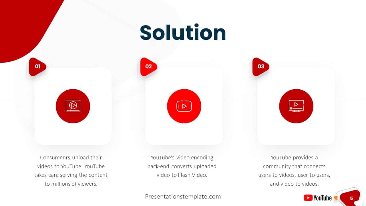
The Best Simple Pitch Deck PowerPoint Layouts That Attract Investors
Investors spend less than three minutes looking at your deck, so every layout choice matters. You want a design that guides the eye exactly where you want it to go. Avoid walls of text at all costs because they force your audience to read instead of listening to your narrative.
Slide Strategy and Design
Keep your layouts clean by sticking to one core message per slide. When you clutter a screen, you lose your audience's attention span. Use high-contrast fonts and keep your color palette limited to three primary tones to maintain a professional look.
- Use the rule of thirds to balance your imagery and text.
- Select sans-serif fonts to ensure clarity on projector screens.
- Include white space to let your most important data points breathe.
- Align your elements consistently to create a sense of order.
These layout choices ensure that your presentation feels polished without looking over-engineered. I personally prefer a minimalist approach where the visuals support the story rather than distracting from it.
Recommended Presentation Tools
Choosing the right platform changes how you build and deliver your message. Some tools offer robust templates that handle the heavy lifting of design, allowing you to focus on your narrative. These options provide the structure needed for a winning deck.
- Canva: Best for drag-and-drop design.
- Beautiful.ai: Best for automated slide formatting.
- Gamma: Best for structured document presentations.
- Pitch: Best for professional collaborative decks.
Canva works well if you want total control over every pixel on the screen. Beautiful.ai steps in when you need the software to handle the spacing and alignment for you. Gamma represents a fresh take, shifting the focus to content flow. Pitch excels when you are building a deck alongside a co-founder or a team member. You should pick the one that fits your workflow, not just the one with the most features.
Wrapping Up Your Narrative
Ultimately, a successful pitch deck relies on clarity rather than fancy animations or complex transitions. Keep your layouts clean, keep your message focused, and always prioritize the investor's experience. Good luck with your next round of funding, and remember that simple design often wins the day.