Mastering the Art of the Minimalist Pitch Deck to Secure New Clients
Have you ever sat through a pitch deck that felt more like a textbook than a conversation? We have all been there, squinting at cluttered slides while the presenter struggles to find their point. A clean deck keeps the focus on your story rather than the noise.
By stripping away the extra design elements, you allow your actual message to stand out. Clients appreciate clarity because it respects their time. When you present a simple deck, you demonstrate confidence in your value proposition.
Best Pitch Deck Tools for Professionals
Canva
Best for custom graphic design.
Canva makes it easy to build professional presentations without needing a degree in design. You gain access to a massive library of templates that prioritize white space and readability. I appreciate how quickly you can drag and drop elements to get a layout that feels intentional and sharp.
- Drag and drop editing makes layout changes effortless.
- Access thousands of clean templates that minimize clutter.
- Brand kits keep your colors and fonts consistent across every slide.
- Collaboration features let your team provide feedback directly on the design.
Pitch
Best for modern startup decks.
Pitch feels like the future of presentations because it focuses entirely on the storytelling aspect. The interface is clean and helps you organize complex data into digestible chunks. I find that it prevents the typical overcrowding that ruins so many professional slide decks.
- Smart templates guide you through a logical narrative structure.
- Data visualization tools present your metrics without overwhelming the viewer.
- Live editing keeps your team aligned during the final design phase.
- Export options work perfectly for high-quality screen shares or PDFs.
Strategic Tips for Your Next Presentation
Keep your text to a bare minimum on each slide. If you find yourself reading from the screen, the slide contains too much information. Instead, use the slide as a visual anchor while you provide the detail verbally.
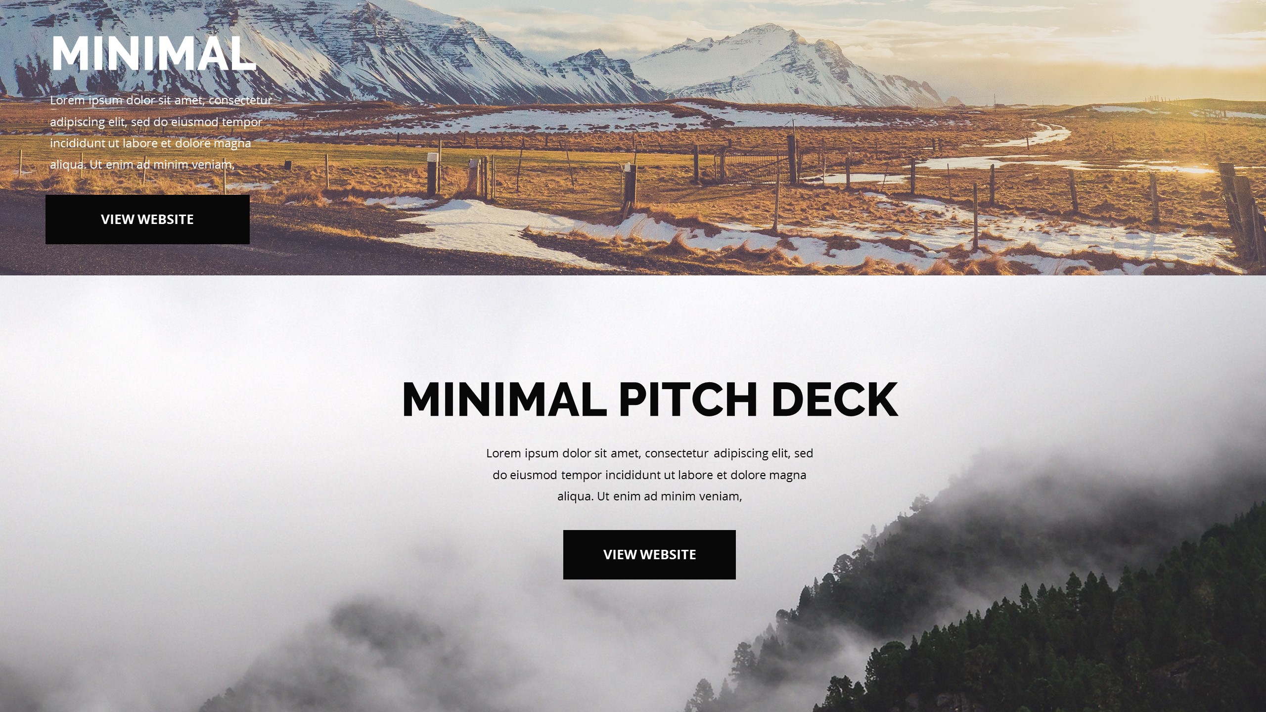
Use high-quality imagery to support your points rather than filling the gaps with text. A single powerful photograph often does more work than five bullet points. This shift in approach makes your pitch feel more like an engaging discussion than a lecture.
Final Thoughts on Pitching
Building a great deck requires restraint more than it requires flair. Stick to a simple palette and clear typography to show your audience that you value precision. Now go out there and build a deck that actually moves your clients to say yes.