Pitch Deck Mastery: Layouts That Secure Funding
When founders walk into a room, the first thing that catches an investor’s eye is the deck’s design. A well‑crafted layout turns data into a narrative and keeps the audience hooked. Below, I’ll walk you through the templates that consistently win approval.
Why Layout Matters
First Impressions Count
Investors skim the first few slides before deciding whether to stay. A clear structure signals confidence and professionalism. If the deck feels chaotic, the idea itself can get lost in the noise.
Storytelling Through Slides
Every slide should push the story forward. Think of each slide as a chapter: it introduces a problem, offers a solution, and shows the payoff. A compelling sequence keeps the audience invested in the outcome.
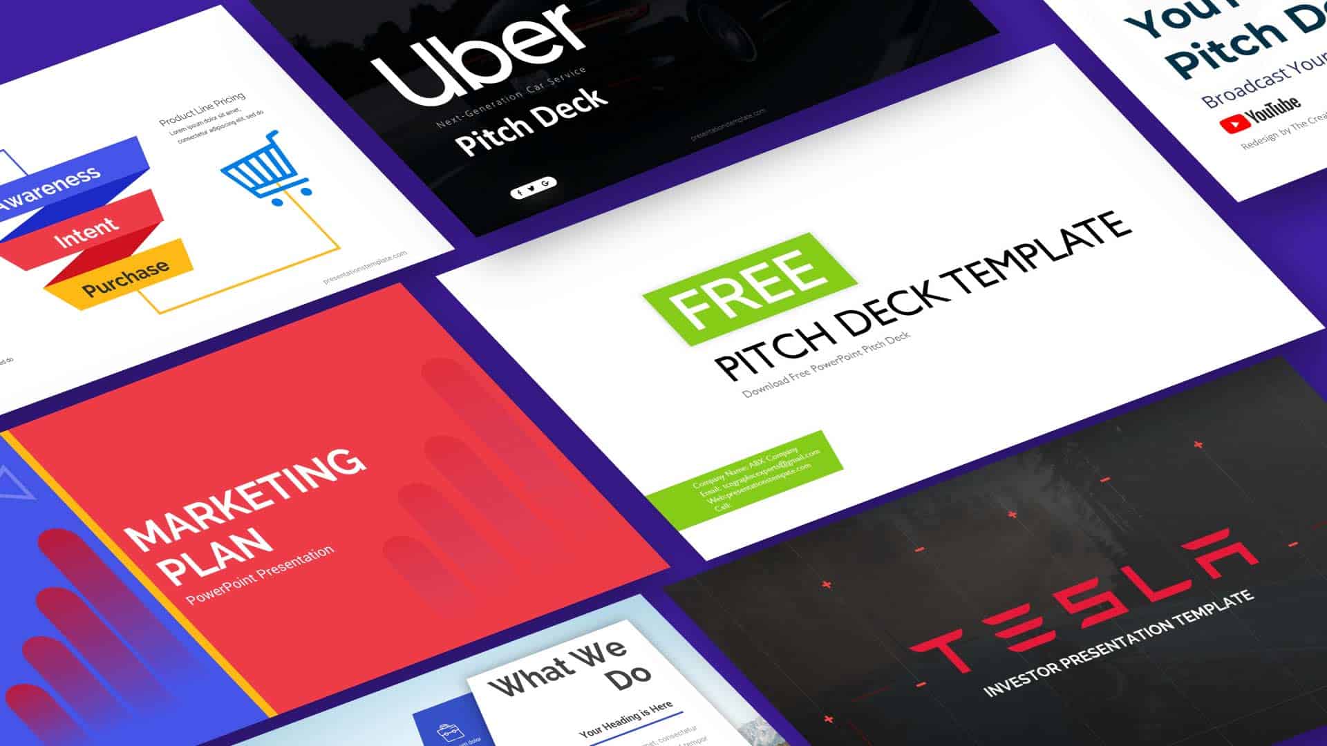
Top Layout Templates
The Classic Five-Page Blueprint
This template is a proven favorite among early‑stage founders. It balances detail with brevity, making it easy to cover the essentials without overwhelming the audience.
- Cover: Company name, tagline, and one striking visual.
- Problem: Clear statement of pain point and market size.
- Solution: Your product and key differentiators.
- Market: Target segment and growth projections.
- Ask: Funding amount and use of proceeds.
The Data-Driven Deck
Data lovers will appreciate a structure that foregrounds metrics. This layout lets you showcase traction, financials, and benchmarks in a logical flow.
- Traction: Users, revenue, and key milestones.
- Financials: P&L snapshot and forecast.
- Benchmarks: Comparison with industry peers.
- Team: Experience that backs the numbers.
- Funding: Desired amount and exit strategy.
The Visual Story Deck
For founders who thrive on design, this template prioritizes visuals and storytelling. It’s ideal when you want to paint a picture of the future rather than crunch numbers.
Use high‑impact graphics, minimal text, and a consistent color palette to guide the viewer’s eye from problem to solution.
Design Tips That Persuade
Keep It Clean
A cluttered slide feels like a cluttered mind. Stick to one idea per slide and leave plenty of white space for emphasis.
Use Contrast
Strong contrast between text and background makes information easier to digest. Dark text on a light background or vice versa works best in most settings.
Show Growth, Not Just Numbers
Numbers are important, but growth stories resonate more. Highlight trends, user acquisition curves, and key milestones to illustrate momentum.
Common Pitfalls to Avoid
Overloading Slides
Too many bullet points or dense paragraphs can turn attention away from your key message. Aim for one takeaway per slide.
Skipping the Market Gap
Investors want to see a clear gap your product fills. If the market need isn’t obvious, the deck loses credibility.
Putting It All Together
Start by choosing a template that matches your stage and audience. Then, refine each slide to tell a coherent story, test the deck with a friend, and iterate based on feedback. The final version should feel like a conversation, not a lecture.
Next Steps
Grab a template, fill in your data, and rehearse your pitch until you can deliver it without reading the slides. A polished layout paired with confident delivery is the recipe for a funded future.