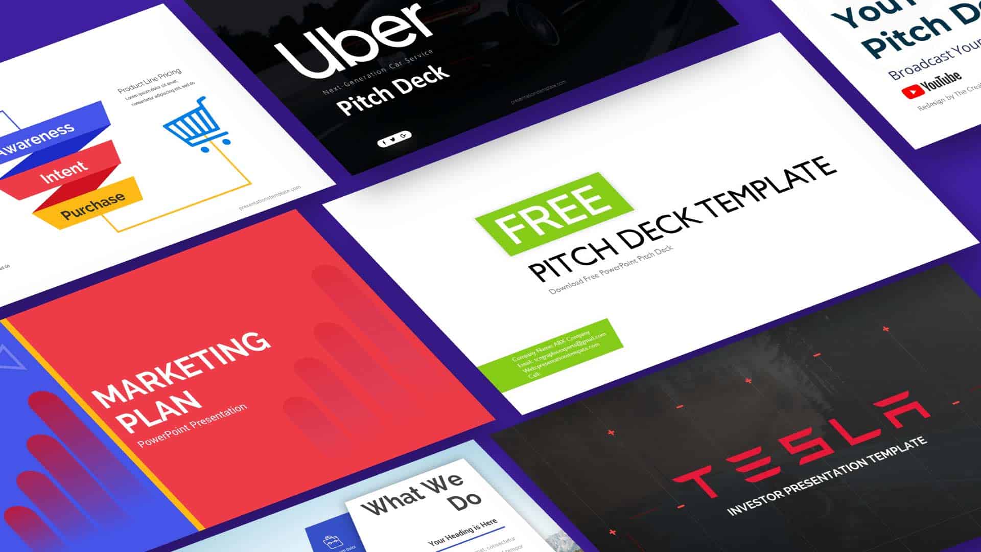
Unlock the Power of a Modern Free Elevator Pitch Deck Template: Design That Sells
Ever stared at a blank slide and felt a wave of doubt? That moment can be turned into a confidence boost with the right template. A modern free elevator pitch deck template offers clean design, ready‑made layouts, and brand‑friendly elements that let you focus on the story you want to tell. Let’s dive into why it matters and how to make the most of it.
Why a Modern Free Template Matters
Visual Storytelling Takes Center Stage
When investors flip through a deck, they skim for the narrative arc, not the font. A template built on a solid grid system guides the eye from one point to the next, creating a rhythm that feels natural. By placing key data points on the rule‑of‑thirds, you keep the viewer engaged without forcing them to hunt for meaning. This visual flow turns a list of facts into a memorable story.
Another advantage is consistency across slides. Consistency reduces cognitive load, letting the audience absorb the message rather than decipher the format. A template that keeps margins, spacing, and typography uniform means you spend less time tweaking and more time refining content. The result is a deck that looks polished from the first slide to the last.
Free templates also level the playing field for startups. You no longer need to hire a designer for each slide; the design work is already done. This saves time and money, allowing you to allocate resources to product development or market research. In short, a modern free template turns design into a strategic asset rather than a cost.
Core Features That Set the Template Apart
Layouts and Grid Systems
Every slide in this template follows a clean, modular grid that supports both text and visuals. The grid divides each slide into thirds, giving you natural anchor points for headlines, images, and bullet lists. You can drop a chart into the left third while placing a headline in the right, creating balance without extra effort.
Because the grid is responsive, it works on both widescreen monitors and standard laptop displays. This flexibility means you can present at a conference, a board meeting, or a coffee‑shop brainstorming session without worrying about pixelation. The layout also adapts to different content densities, so you can add more slides without breaking the visual harmony.
Additionally, the template offers pre‑set slide variants—such as title slides, data slides, and closing slides—each tailored to a specific function. These variants come with placeholder text that hints at the best way to structure information. When you replace the placeholders, the design remains intact, saving you from accidental layout shifts.
Color Palettes and Branding
Brand identity starts with color. The template includes a curated palette that can be swapped with your own brand colors in a single click. This ensures every slide reflects your company’s visual voice without manual editing.
Beyond color, the template offers consistent iconography and typography choices that reinforce brand personality. You can choose from a selection of icons that match the tone—professional, playful, or tech‑savvy—without needing to search for third‑party assets.
Because the design is modular, you can layer additional branding elements, such as logos or watermarks, without disrupting the layout. The template’s structure keeps these elements in place, ensuring they appear exactly where you want them on each slide. This level of control lets you maintain brand cohesion across the entire deck.
Practical Tips for Building a Winning Pitch Deck
Structure Your Story Like a Movie
Start with a hook: a single slide that poses a problem or presents a bold claim. This sets the stakes for the audience. Then follow a classic narrative arc—setup, conflict, resolution—using the template’s slide variants to guide the flow.
Keep each slide focused on one idea. Use a headline that captures the core message, and limit bullet points to two or three. When you add visuals, make sure they illustrate the headline, not distract from it.
Remember that the audience’s attention span is short. Aim for a deck that lasts 8–10 minutes when spoken. If you need more detail, consider adding a supplemental slide deck that investors can review later.
Use Data Wisely
Charts and graphs should tell a story, not just display numbers. Choose the right chart type—bar for comparisons, line for trends, pie for proportions—so the data speaks clearly. The template’s chart placeholders come with built‑in styles that keep your visuals consistent.
Don’t overload slides with data. If a chart is too dense, split it across two slides or use a summary slide that highlights the key takeaway. A single takeaway per slide keeps the narrative tight.
When you insert data, double‑check the source. Credibility matters, and a single misquoted statistic can undermine the entire pitch. Use footnotes sparingly; a parenthetical note in the slide footer works well.
Polish and Practice
After drafting, run a dry rehearsal. Time each slide to ensure the pacing feels natural. If a slide feels rushed, consider trimming text or adding a visual break.
Invite a colleague to review the deck. Fresh eyes can spot layout inconsistencies or confusing wording. Use their feedback to tighten the narrative further.
Finally, export the deck as a PDF to preserve formatting across devices. A PDF also makes it easy to share with investors who prefer a static view. Test the PDF on multiple screens to confirm everything displays correctly.
Avoiding Common Mistakes
Keep Slides Focused
It’s tempting to cram every detail onto one slide, but that defeats the purpose of a pitch deck. Each slide should convey a single idea. If you need more depth, use an appendix or follow‑up materials.
Avoid excessive text. Use concise language and let visuals carry the weight. Remember, the deck is a visual aid, not a script.
Stay Consistent
Consistency in fonts, colors, and spacing creates a professional look. The template handles most of this, but double‑check that no accidental changes slip in when you edit placeholders.
Keep your logo placement uniform. A misaligned logo can look sloppy. The template’s grid ensures the logo stays where it belongs on every slide.
Final Takeaway
Choosing the right template is the first step toward a compelling pitch. A modern free elevator pitch deck template gives you a solid foundation, letting you focus on storytelling, data, and delivery. With clean layouts, brand‑friendly palettes, and practical guidance, you can craft a deck that captures attention and drives action. Now it’s time to pull the template, fill in your story, and present with confidence.