Mastering Your Pitch Deck Design for Maximum Investor Impact
Have you ever watched a great product idea sink because the slides looked like a high school science fair project? A pitch deck acts as your first handshake, and in the world of venture capital, that impression sticks harder than glue. You do not need a degree in graphic design to build something professional, but you do need a sharp eye for layout and hierarchy.
Best Modern Design Tips
Simplify Your Visual Narrative
Investors flip through decks at a breakneck speed, often spending less than three minutes on the entire document. You must strip away the clutter and focus on one core message per slide. If your audience has to hunt for the point, you have already lost them (and yes, they really are that impatient).
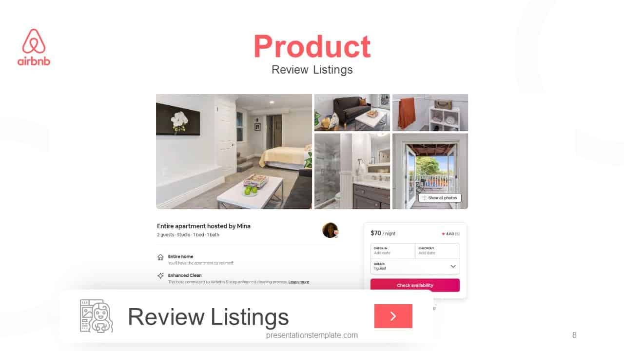
- Use one large, high-quality image per slide to anchor the reader.
- Limit your text to three bullet points or one clear, bold statement.
- Choose a consistent color palette to build brand recognition throughout the presentation.
- Utilize white space to let your most important metrics breathe.
Highlight Data with Intentional Graphics
Tables filled with tiny numbers cause eyes to glaze over faster than you can explain your revenue growth. Instead of dumping raw data onto the screen, visualize your progress using clean charts or singular, massive statistics that demand attention. You want the board to see the trajectory of your business, not the minutiae of your accounting software.
- Convert complex spreadsheets into simple line charts or bar graphs.
- Use contrasting colors to highlight the most impressive growth metrics.
- Label every axis clearly to avoid any confusion during the reading process.
- Keep your fonts bold and large enough to read on a mobile device screen.
Top Tools for Deck Creation
Canva
Best for quick visual layouts. You can pull from thousands of templates that handle the heavy lifting of design for you. It allows you to drag and drop assets without any technical headaches.
- Access a massive library of stock photos and icons to supplement your brand images.
- Export slides in various formats that ensure high resolution across all devices.
- Share links with your team for real-time adjustments before the big meeting.
Beautiful.ai
Best for automated slide arrangement. This tool keeps your formatting locked as you add content, preventing those annoying layout shifts that happen in traditional software. It handles the structural heavy lifting so you stay focused on your story.
- Adjust slide contents without breaking your overall theme or spacing rules.
- Maintain consistent professional margins and alignment across every single slide.
- Choose from smart templates that adapt based on the data you provide.
Final Thoughts on Your Pitch
Design is not about fluff; it is about clear communication. When you prioritize readability and emotional resonance, your deck stops being a wall of text and starts being a story. Take your time, polish your assets, and keep your focus on what actually matters to the person across the table.