Investor-Ready Pitch Deck Samples: Exactly What VCs Want to See
What VCs Look for in a Deck
Problem Statement
First thing they scan is whether you’ve nailed the pain point. If the problem feels vague, the whole deck loses steam. I like to start with a single, relatable anecdote that paints the issue in plain terms. That hook pulls the reader in and sets the stage for the solution.
Solution Overview
Your answer must be crisp and compelling. I always strip away jargon and focus on the core benefit that solves the problem. A quick demo screenshot or a short video link can turn abstract ideas into something tangible. Remember, VCs are looking for impact, not just features.
Market Size
VCs need confidence that the opportunity is big enough to justify their risk. I present a top‑down TAM figure, then narrow it to your serviceable market. Adding a visual bar chart helps the numbers stick in their mind. Keep the math honest; inflated claims raise red flags.
Structure of a Winning Deck
Cover Slide
The cover should scream professionalism. I use a clean logo, a punchy tagline, and my contact details. No clutter, just enough to make a memorable first impression. A well‑designed cover primes the reviewer for the story ahead.
Team Slide
Investors bet on people more than ideas. I showcase each founder’s relevant experience in a concise bullet list. Highlight past exits, industry expertise, or technical chops that directly relate to the venture. A strong team slide can tip the scales.
Financials
Numbers are the backbone of any pitch. I lay out three‑year projections, unit economics, and key assumptions in a tidy table. Include a brief note on cash burn and runway to show you understand runway management. Transparency here builds trust.
Real-World Examples to Emulate
Airbnb’s Early Deck
Airbnb kept it simple: a problem‑solution slide, market validation, and a clear revenue model. I admire how they used real booking data to prove traction early on. The deck’s minimal design lets the story shine without distraction.
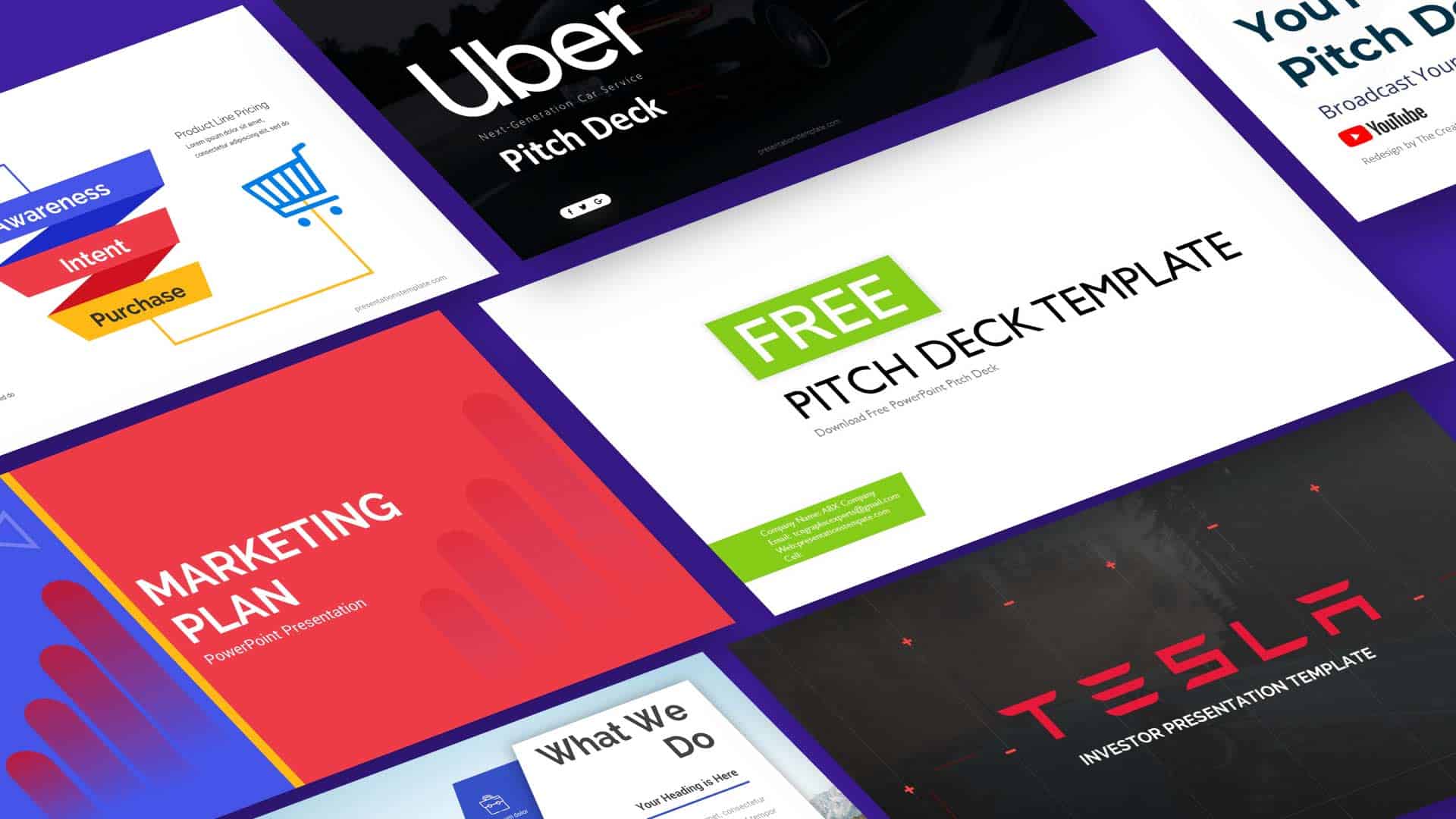
Uber’s Growth Deck
Uber focused on network effects and a bold vision for city transportation. Their slide on driver incentives paired with rider growth charts made the scale argument undeniable. I try to mirror that balance of vision and hard data.
Dropbox’s Simplicity
Dropbox’s deck boiled down to a single line: “Your files, everywhere.” The visual of a cloud with a sync arrow conveyed the concept instantly. I often borrow that one‑sentence value proposition technique for clarity.
Tips to Polish Your Deck
Design Consistency
Stick to one font family, color palette, and icon style throughout. I find that a consistent look reduces cognitive load and lets the content speak louder. Even small details like line spacing can make a big difference.
Storytelling Flow
Arrange slides like a narrative arc: hook, conflict, climax, resolution. I treat each slide as a chapter that builds on the previous one. When the story feels natural, the deck becomes far more persuasive.
Data Credibility
Source every statistic and include a footnote or hyperlink. I avoid vague phrases like “industry reports say” without a citation. Credible data backs up your claims and shows you’ve done the homework.
Conclusion
Crafting a pitch deck that wins over VCs is part art, part discipline. Focus on a clear problem, a tangible solution, and solid numbers, then wrap it all in a clean design. Test your deck with mentors, iterate, and you’ll increase your odds of getting that coveted meeting. Good luck, and may your next pitch open the door to growth.