Mastering Engagement: Top PowerPoint Design Strategies That Actually Work
Do you ever feel like your audience loses interest the moment you open your slides? Most presentations suffer from a lack of visual hierarchy and far too much text. If you want to stop the mid-presentation slump, you need to rethink how you structure your information.
Best Presentation Tools for Impact
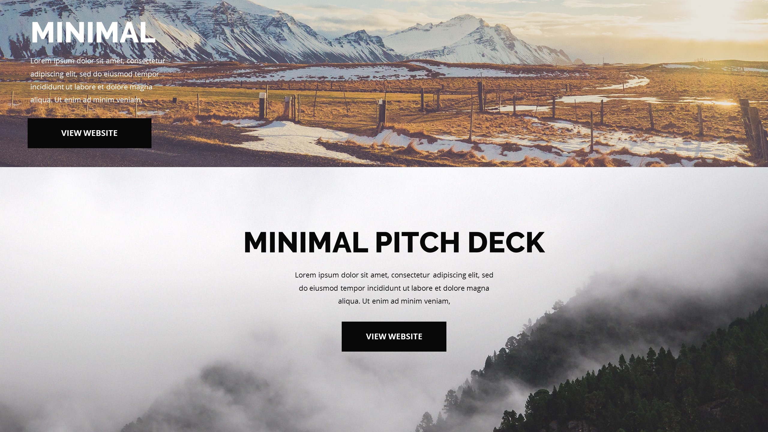
Beautiful Deck Creation
Beautiful makes your slide deck look professional without requiring a degree in graphic design. You select the tone you want, and the layout adjusts to keep your content readable and bold. It removes the stress of aligning elements manually, which saves you a lot of time during preparation.
- Builds clean layouts that focus on key messages.
- Maintains consistent branding throughout your entire slide deck.
- Supports smooth transitions between complex data points.
- Best for Professional Corporate Presentations
Colossyan Video Integration
Colossyan changes the way you add human presence to your slides by letting you create presenters that speak your content. I find this helpful when you need to narrate a slide deck but prefer not to record your own voice multiple times. It brings a level of polish that standard static images cannot match.
- Offers lifelike avatars that articulate your points clearly.
- Enables multi-language support for diverse global audiences.
- Integrates well with existing slide content for better engagement.
- Best for Interactive Training Modules
Designing for Real Audience Connection
Design is not just about making things pretty; it is about guiding the viewer's eyes to what matters. Avoid cluttering your workspace with too many charts. Instead, highlight one core insight per slide to ensure your message hits home.
Use high-quality imagery to evoke an emotional response from your listeners. When you pair a strong visual with a clear, punchy headline, you help your audience retain information longer. Remember, the slide exists to support you, not to replace your voice.
The Power of Minimalist Layouts
Less is almost always more when it comes to PowerPoint design. If your audience is busy reading your slides, they are not listening to you. Keep your bullet points short, limit your word count, and use white space to let the ideas breathe.
- Use large typography to emphasize your main argument.
- Limit each slide to one specific takeaway concept.
- Apply consistent color palettes to establish a visual rhythm.
- Stick to high-contrast text to ensure legibility across large rooms.
Final Thoughts on Slides
Improving your presentation design does not need to be a massive overhaul of your workflow. Start by trimming the excess text and choosing better visuals for your core points. Your audience will definitely appreciate the effort to keep things clear and engaging.