Stop Losing Investors With These Common Pitch Deck Mistakes
The Fatal Errors Hidden in Your Slides
Have you ever wondered why your pitch deck gets ignored despite having a solid product? Most founders fall into traps that kill interest before a meeting even starts. If you ignore how you present your data, you lose the room.
Investors do not want to read a novel on a single slide. They seek clarity and a reason to care about your vision. When you clutter your deck, you lose the narrative thread that keeps potential partners engaged.
Overloading Slides With Dense Text
The biggest sin in fundraising is the wall of text. You should treat your slides as visual anchors, not your speaker notes. If the reader spends the whole time reading, they stop listening to you.
- Keep your bullet points limited to three or four per slide.
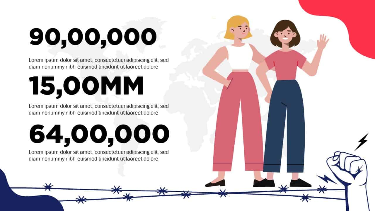
- Use large font sizes to emphasize key metrics that matter.
- Focus on one single theme per slide to avoid confusion.
- Remove industry jargon that obscures your core value proposition.
Lacking a Clear Financial Story
Investors often skip directly to your financial projections. If these numbers lack logic, your credibility vanishes instantly. You must prove you understand your own market and growth levers.
- Show your revenue model without hidden complexity.
- Validate your growth assumptions with real pilot data.
- Highlight your burn rate and your path to profitability.
- Explain exactly how you plan to deploy the capital raised.
Tools to Refine Your Presentation
Beautiful
Best for Building Visual Decks
Beautiful helps you design professional slides without the design headache. You choose a layout, drop in your content, and the platform handles the alignment and spacing. It stops you from making ugly slides that distract from your actual message.
- Offers clean templates that keep your layout consistent.
- Automates formatting so you focus on the story.
- Allows you to add branding elements without deep technical skill.
- Provides collaboration features so your team can edit together.
Canva
Best for Creating Custom Graphics
Canva works best when you need to turn boring data into digestible visuals. You can drag and drop icons, charts, and images to make your deck pop. It saves you from using generic clips that make your company look small.
- Accesses a massive library of photos and graphical assets.
- Helps you build custom data charts that are actually readable.
- Enables easy exports into PDF or PPT formats for meetings.
- Contains drag and drop tools that remove the steep learning curve.
Final Thoughts on Your Pitch
Fundraising is a game of persuasion as much as it is about numbers. Fix these mistakes and your deck will finally stand out from the noise. Go back to your slides today and cut the fluff.
Investors reward people who value their time and show vision. Keep your story tight, your data clean, and your deck focused. You have the potential to win; just stop letting your slides get in the way.